The Chart

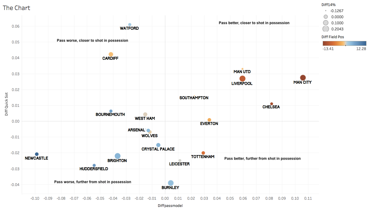
Trying to smash as much team level data into one chart so you can glance at it and see what is going in a league and understand how teams are playing. So the teams on the right are the teams that pass better than their opponents (my passing model with start, end, where horizontally on pitch you are, where in possession you are, speed of attack and a few other variables in it). The teams at the top are those who are quicker than opponents in possession to get a shot off. The size of the circle is relative % of good shots a team takes compared to opponent and color is field position: blue means opponents start closer to goal than they do, orange means they start higher up than opponents.
All this comes at even game state to get the best read.
Takeaways
United looks quite similar to Liverpool except they are losing field position battle: Liverpool have about a 10 point edge there, and United aren't winning the "good shot battle", opponents take a significantly higher % of good shots than they do while Liverpool dominates that category like Man City.
Chelsea are closing in on being "passing kings" but Man City is still top dog there. Chelsea actually has the highest passing model score but defensively is only 4th while Man City is first by a good bit.
Tottenham are allowing a lot of quick shots out of possession and aren't taking many in possession.
Southampton do a lot of things right but that tiny dot tells you what's gone badly badly wrong. They don't take good shots really while opponents take 50% of their shots inside 15 yards.
Cardiff attempt the most difficult passes in the league but actually wind up even in field position battle because of the length of their passes.
Newcastle have played a brutal schedule, I want to do a schedule-strength adjusted table tomorrow but it will take a bit of time. Still awful numbers.
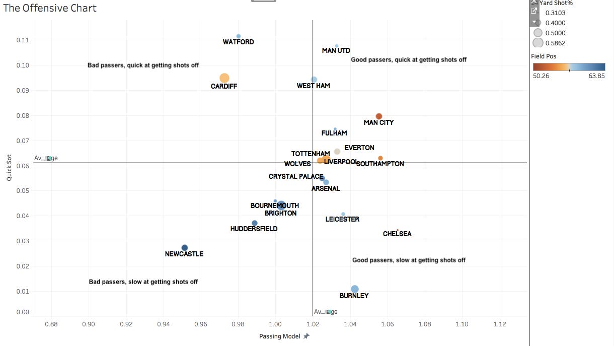
Burnley are actually outpassing opponents, but can't get shots off. Shots come within 15 seconds on just 1.1% of their open-play passes*, the lowest in the league.
Watford on the other hand are at 11.1% in that metric trying similarly difficult passes and starting their possessions basically on the same spot on the field as Burnley.
Fulham you can't see but are a tiny white dot right by Arsenal. Fulham can't really get good shots off, taking 3rd-most long shots as a proportion of total (Chelsea are 2nd!).
* somewhat rough estimate
I think there could be some honing of the variables here and definitely a schedule-strength adjustment but I feel like this is a great cheat-sheet for understanding what is going on, I might have to break it into offense and defense charts separately as there is just too much info on one...I'll try that here actually.


